Podium Design System
B2B Platform Design System · 3D Design Tools · Design Tokens · Components
This case study highlights my three-year experience in maintaining a design system through two major versions, a company rebrand, and a full organisational spin-out.
When I took on the Podium design system, designers were working around it more than with it. Duplicated components, conflicting patterns, and a growing gap between what was in Figma and what was in production.
~80% parity
Figma to Production
10 designers
4 products
served across consumer-facing and internal tools

Podium Platform UIs: the 3D design environment used by architects and engineers on the left,
and the supplier-facing portal on the right
The challenge
Silos, duplicates, and a system that everyone finds challenging
After running a workshop and digging into Figma's component library analytics, the picture became clear.
Core issues
Inconsistent UI across platforms and between products
A significant gap between what was in Figma and what was in production
Components were hard to find and harder to understand. Designers spent more time deciphering the library than designing
Handoff was painful, with engineering regularly having to resolve ambiguity that the system should have resolved for them
Duplicated and conflicting components made scaling new features slower than it needed to be
Constraints
No dedicated design system resource. Design system work ran alongside feature delivery.
A platform built primarily around 3D design tooling. The system had to serve both highly visual 3D scenes and conventional product UI like forms, tables, and dashboards.
A growing set of products spanning two consumer-facing and two internal tools, each with their own edge cases.

Pain points from the workshop, grouped by theme and component analysis, end 2022

Impact-effort prioritisation and the work plan to decide what to fix first and what to leave for later.
The solution
The north star
"How do we design our design system for our designers to enable productivity & creativity while providing a simplified, flexible, easy-to-consume and maintainable library?"
We set that question out at the start and used it as guiding principle whether we were debating a component structure or pushing back on a scope increase. I split the goals into two horizons so we had something achievable near-term without losing sight of where we needed to get to.
Short-term (6 to 8 months): stakeholder buy-in, improved searchability, simplified components, documentation, and standardised usage across product surfaces.
Long-term: design tokens, a federated model, a published design system site, and versioned releases.
Design System v1.1
Getting the basics right
After six months of planning, design reviews, iteration, and implementation work with engineering, we shipped v1.1. Every week, I design a component, review it with the team, test it, iterate, publish. Every two weeks, I host a joint session with engineering to prioritise implementation and manage migration.
By 2023, Podium was running two consumer-facing products and two internal tools. With this extension of product range, we introduced visualisation components, advanced table layouts, and form displays that hadn't previously existed.

Design System v1.1 in use across two product surfaces; the 3D construction environment and the property analytics dashboard, both running off the same system.

The extended components introduced in v1.1 to serve Podium's internal tools, data-dense layouts, financial tables, and reporting dashboards that didn't exist in the original library.
Design System v2.0
A clean break with the past
At the end of 2023, Podium separated from Lendlease and became an independent start-up. Teams restructured and product lines were redefined. We used the opportunity to do what v1.1 couldn't: start fresh.
v2.0 was a full rebuild. New branding, new design language, new foundation library from scratch. Every component and icon was converted to align with the new visual identity. Design tokens were introduced properly for the first time.

Design System v2.0 foundation, type scale, icon set, and the full colour system documented
for the first time as proper design tokens.

Design System v2.0 applied to Podium's core product with new branding, new UI patterns.

Design System v2.0 components serving the supplier portal. Product detail forms and bulk data import, both built on the new foundation library.
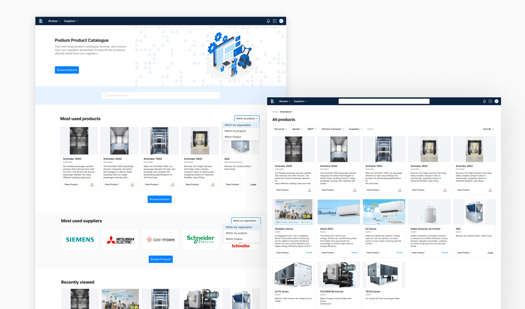
Product Catalogue and Product listings view for Supplier Portal
Communication
Making the system feel shared
As part of the design system governance and maintenance, we set up three channels to create visibility without adding overhead.
A dedicated Slack channel for updates, feedback, and quick questions.
A bi-monthly newsletter highlighting changes, new releases, and best practices.
And a bug report workflow so designers had a clear path to flag issues rather than quietly working around them.

The dedicated Slack channel and bi-monthly design system newsletter.
Outcomes
What the data said
We didn't set out with a formal metrics framework, which is something I'd approach differently now. But Figma's component analytics and designers feedback gave us a reliable insights. Consistent themes are faster onboarding for new designers, fewer UI inconsistencies across products, better searchability, and a noticeably smoother handoff process.

Figma component analytics from 2025 alongside feedback from the design team.
Reflections
What I'd do differently
These past years, I have learnt that a design system is never done. There's always a backlog for better documentation, a more complete colour system, tighter design-dev governance. That list just goes on and on.
The thing I came to understand is that the design system is the product itself. It needs investment, roadmapping, and users who feel ownership over it. Without those things, it decays no matter how well it's built.
Future
As of early 2026, our team has decided to move away from our own design system and adopted the shadcn component library. The decision came as the whole team was moving toward AI-assisted development. LLMs have no training context on a private component library. shadcn is one of the most widely-used, open-source UI libraries, which means AI tools understand it natively.
We also accessed that the completeness of the library such as being community-maintained, Radix-based for accessibility, and well-documented library would be far better off in user experience and development than keep on maintaining on our own design system. Currently, we are in the midst of migrating and this would be a another case study for the future.