A new ordering system for Continental Bookstore
Sole Designer · 2020 · End-to-end redesign
Continental Bookstore is one of Singapore's primary providers of academic textbooks for primary schools. Every year during November and December, the bookstore receives thousands of orders in a tight window. The existing system couldn't handle the rush. Orders were getting lost, customers were losing trust, and the operations team was firefighting constantly.
8K+
Orders processed
at launch
~23
Schools onboarded
at launch
In short
Challenge
Every year, in November and December, orders for academic textbooks by the thousands pour into Continental, within a very narrow time window. The existing system just couldn’t cope with such a rush, leading to order mix-ups and loss of customer confidence.
What I did
End-to end product redesign. I mapped the ordering workflow, completely redesigned the system from scratch to handle the volume of orders, intuitive payment flow and ensure that all orders are trackable for both customers and the operations team.
Outcome
The new system processed 8,000+ orders at launch across ~23 onboarded schools.
Continental Bookstore
The challenge
A system that couldn’t handle its busiest two months
The annual book ordering period is Continental’s most critical operational window. But the legacy system had been built for a quieter time. At peak volume it fell apart, with data integrity issues, lost orders, and incomplete transactions. Parents had real concerns about payment security, and the gap between HQ and branch operations created confusion for everybody.
Core issues
Data integrity failures were causing lost orders and incomplete transactions at peak load
Parents were reluctant to transact online because trust in the payment flow was low
No visibility into school-specific inventory demand, which made stock management guesswork
Communication bottlenecks between HQ and branches resulting in queries took too long to resolve
The ordering flow was unnecessarily complex with too many unclear steps before a parent could even reach checkout
Constraints
No direct access to parents: the project timeline was tight and there wasn’t enough time for direct customer research.
Two distinct user groups with very different needs: a consumer-facing ordering flow for parents, and a backend management system for HQ and branch administrators
Phased delivery: given the scope, we structured the work in two phases: customer experience first, then distributed order management for the bookstore admins
Research
From flows to final screens
I interviewed HQ staff and branch administrators. They had enough regular contact with parents during the ordering period to give us a reliable read on where things were breaking down.
What we learned: parents needed a checkout flow they could trust, with less friction to complete an order and clear order confirmation. The operations team needed branch-level order ownership, real-time inventory visibility, and faster query resolution so HQ could focus on oversight rather than firefighting.
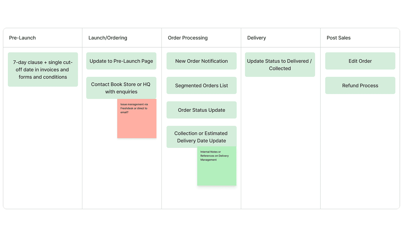
Scope of work diagram showing the two-phase structure across customer ordering and admin order management
The solution
Three steps to checkout
The redesigned customer flow came down to three steps: pick a school, browse the booklist, check out. No account required. For administrators, each branch got clear ownership of their orders, real-time inventory tracking, and automated alerts for stock issues before they became customer problems.
Mapping the flow - I documented the existing journeys for both parents and admins. The customer path had too many unclear steps before checkout. The admin path had no clear handoff between HQ and branches. The redesign addressed both directly.

Simplified three-step customer ordering flow from school selection to checkout

HQ and branch order management flow showing ownership handoff and escalation paths
Information architecture - The system needed to split into two distinct experiences without the customer side feeling complicated. I designed school-specific landing pages, order tracking, and branch-level admin dashboards within a single IA.

Site map for the admin order management system across HQ and branch levels
Refining the design
Communicating clarity and trust
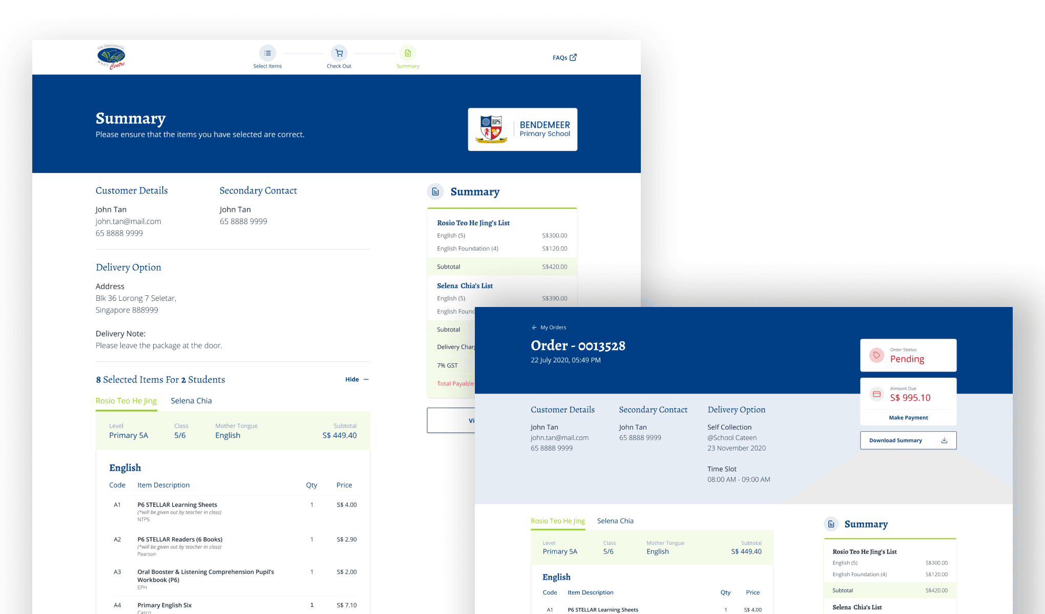
The customer-facing design used Continental's existing brand guidelines, consistent colours and typography. The priority was to communicate clarity and trust for parents who were already uncertain about online payments.
After finalising the high-fidelity designs, I documented the system logic in full with process flows, validation steps, error states, field requirements, data formats, and edge cases. The goal was to reduce ambiguity during development so the engineering team wasn't making design decisions on our behalf.

Low-fidelity wireframes for admin order management tested with the HQ team

High-fidelity customer-facing UI across school selection, booklist, and checkout screens

High-fidelity mobile responsive for customer-facing UI across book selection, order preview, and checkout screens

Engineering handoff documentation covering decision points, validation logic, and error states
Impact
8,000+ orders in year one
In its first year, the redesigned system processed over 8,000 orders during the peak window. Parents could complete purchases without creating an account. For the operations team, distributed order ownership and automated stock alerts significantly reduced time spent on error resolution.
Reflections
Proxy research is still research
Not having direct access to parents was a real challenge. But the operations team, the people who took customer calls and complaints every ordering period, turned out to be a useful source of signal to inform the solution we needed.
The phased delivery kept the work focused to each scope and we could ship something valuable early without losing sight of the whole system.
The hand-off documentation on this project was as important as the UI. An ambiguous design in development is something other than what you intended. Spending time on system logic and flows, edge cases, and error states helps the whole team ensure what we designed is what gets built.