Podium Design System
This case study highlights my three-year experience in maintaining a design system during organisational restructuring and changes in product direction.
Podium
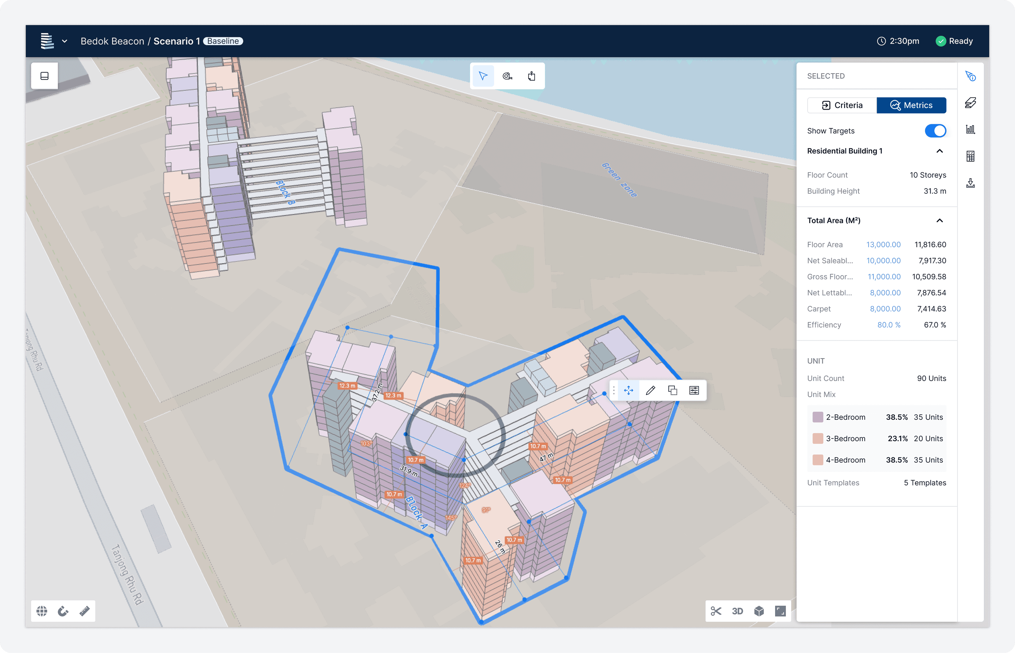
Podium is a design automation and feasibility platform for the built environment, connecting architects, engineers, real estate developers, and suppliers in one place. Before Podium was its own company, it was a digital unit inside Lendlease, called Podium for Development. This context matters because it shaped about how the design system got built, and why it needed to be rebuilt.
My Role
I joined as a Senior Product Designer in July 2022. The team had about 10 designers across different product lines. My initial focus was end-to-end feature delivery.
At the end of 2022, I picked up ownership of the design system. That expanded my scope to: leading and running the design side of the system, gathering feedback and testing components, getting buy-in from PMs, design managers, and engineering leads for roadmap decisions, and collaborating with engineers on implementation.
It wasn't a formal handoff. The system needed someone to actually own it and I was passionate about design systems and interested in them, so I did.
Challenge
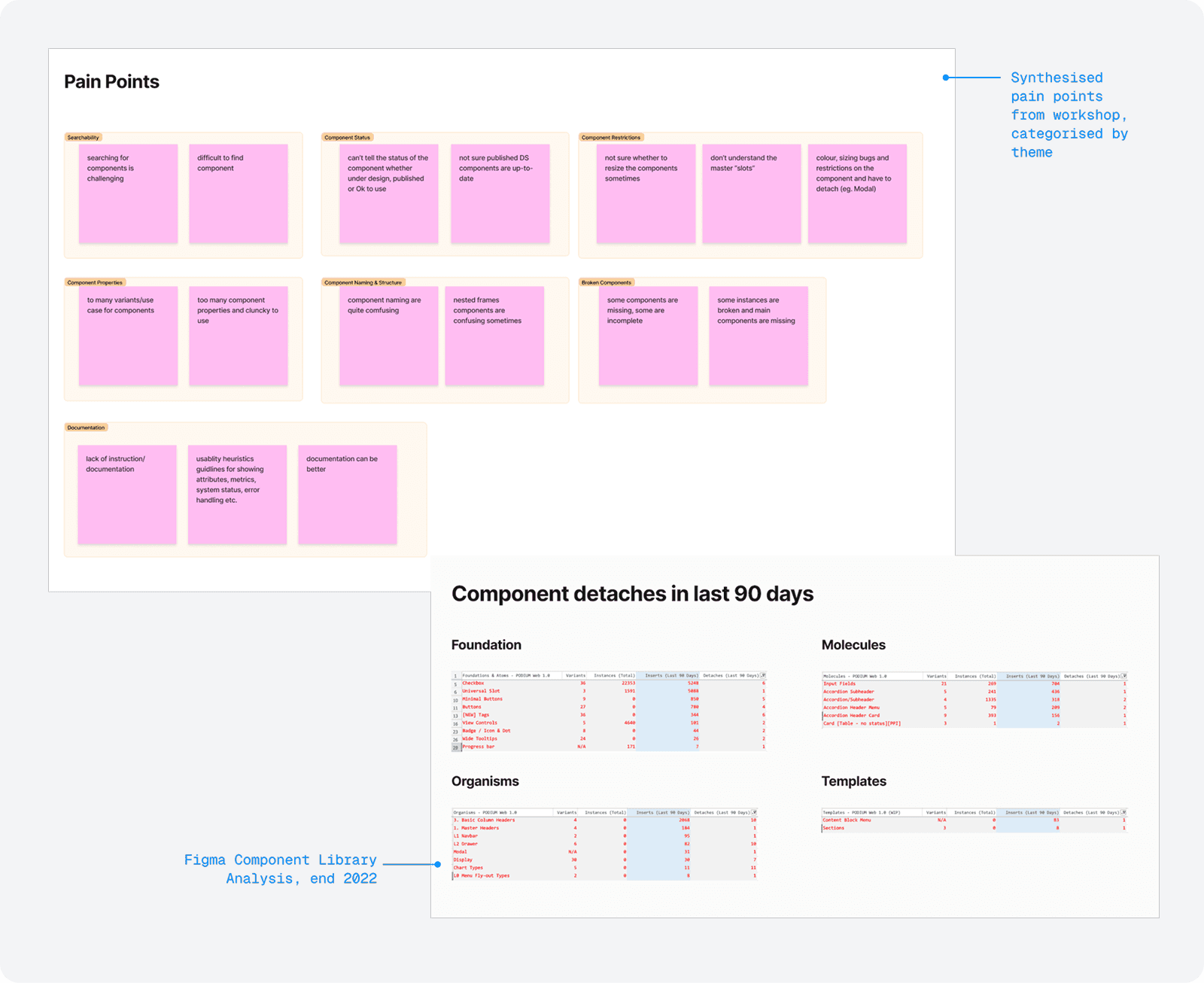
When I inherited the design system, different teams were working in silos. Components got duplicated. Patterns conflicted. Designers spent more time trying to understand how to use a component than actually using it.
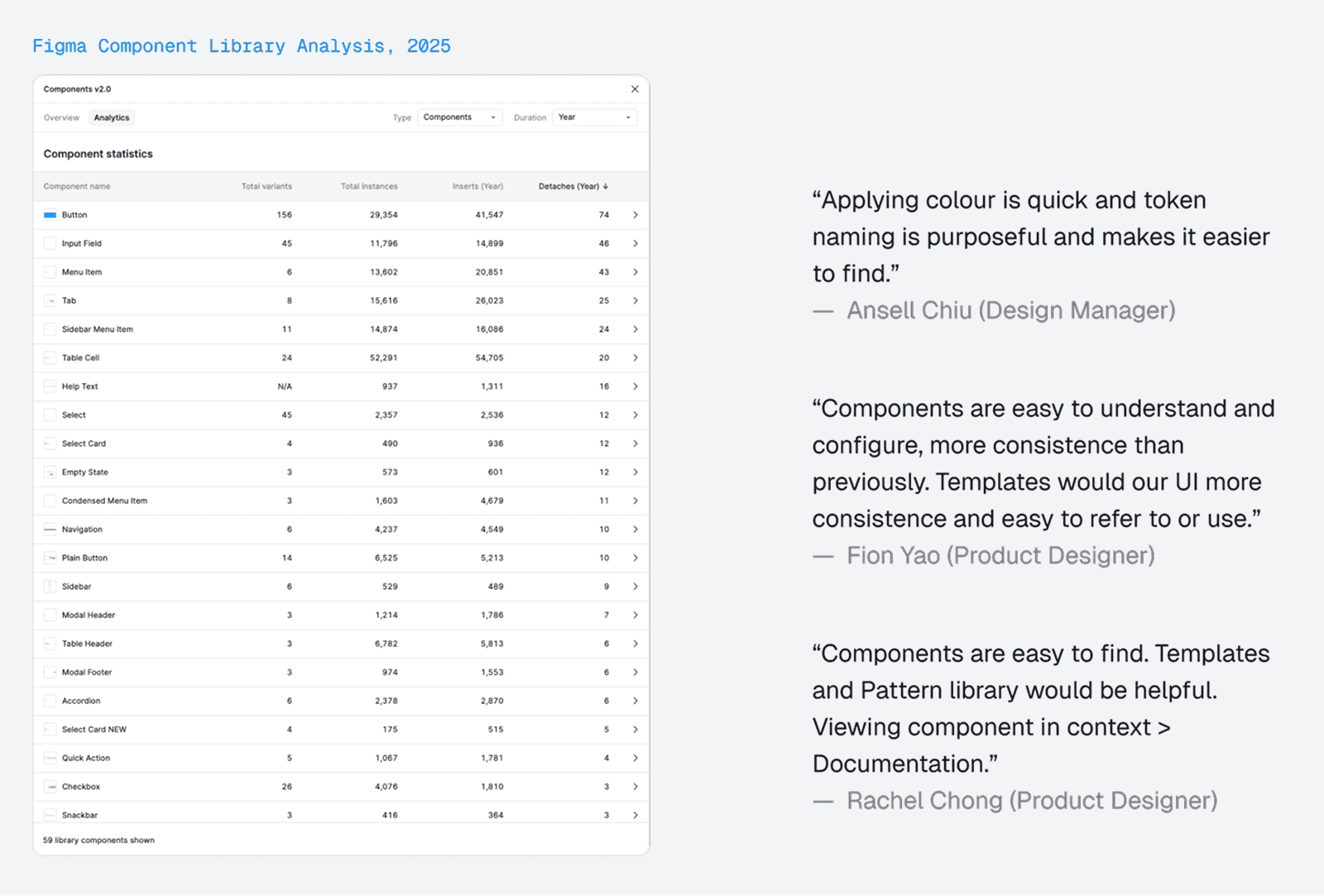
I ran a workshop, dug into the Figma component library analytics, and the picture was pretty clear:
Inconsistent UI across platforms and between design and development
Hard to find, harder to use — components were a maze, not a tool
Conflicting patterns between different products
Duplicated and overly complex component structures
Design-to-dev handoff was painful, every time
New features were slow to ship or implemented without standardised components because the system couldn't keep up
Solution
We knew what we wanted for our design system at that time.
“How do we design our design system for our designers to enable productivity & creativity while providing a simplified, flexible, easy-to-consume and maintainable library?”
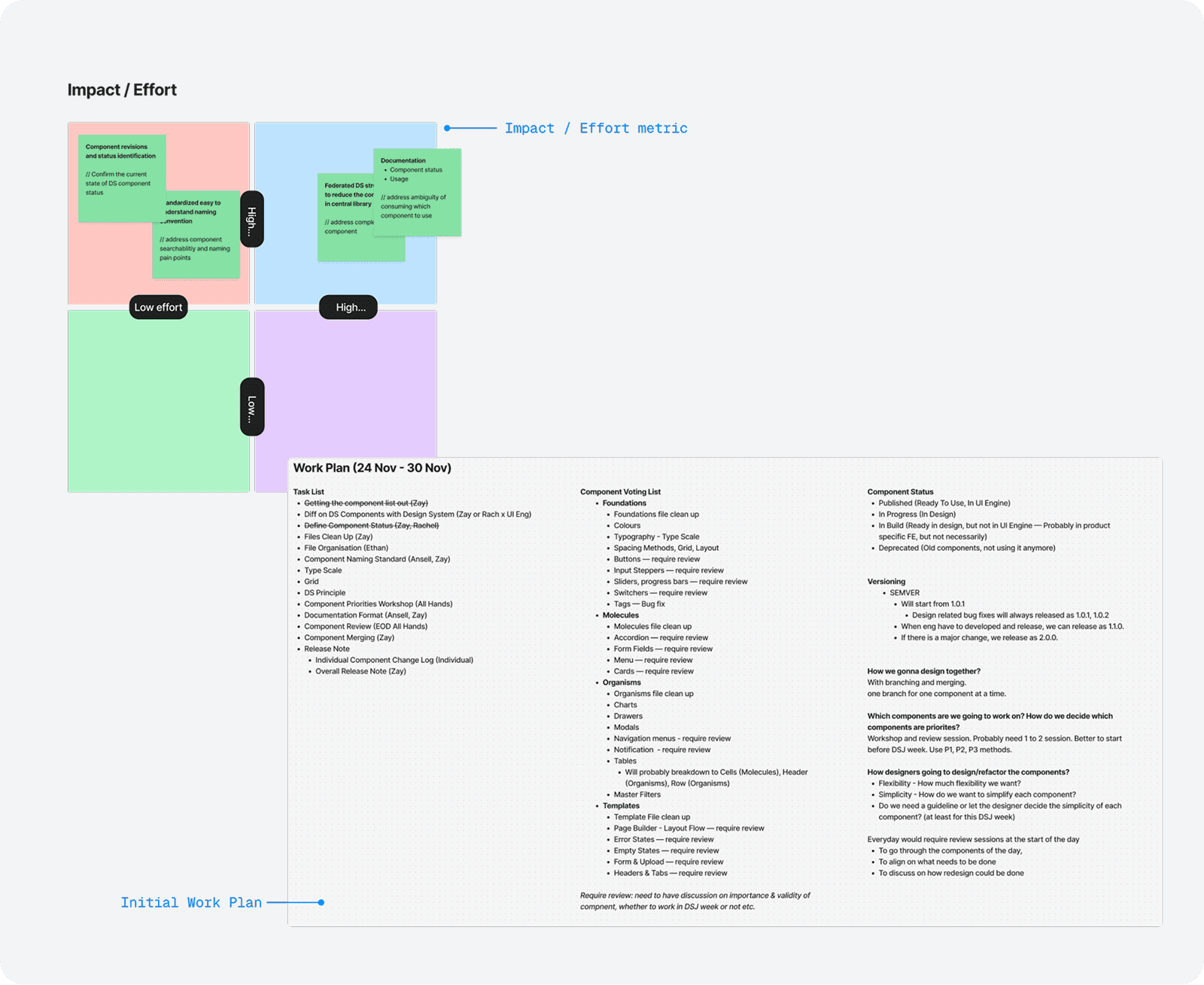
We divided our goals into short-term and long-term to achieve and be able to scale at a sustainable pace for the team.
Short-term goals (6-8 months)
Get stakeholder buy-in
Improve searchability
Simplify components and library
Documentation
Standardise usage across different platforms
Long-term goal
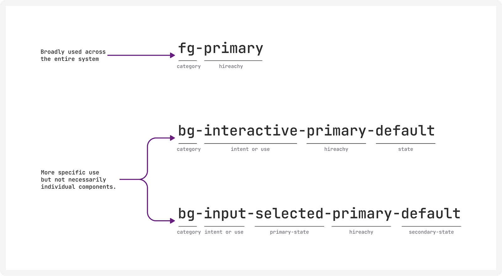
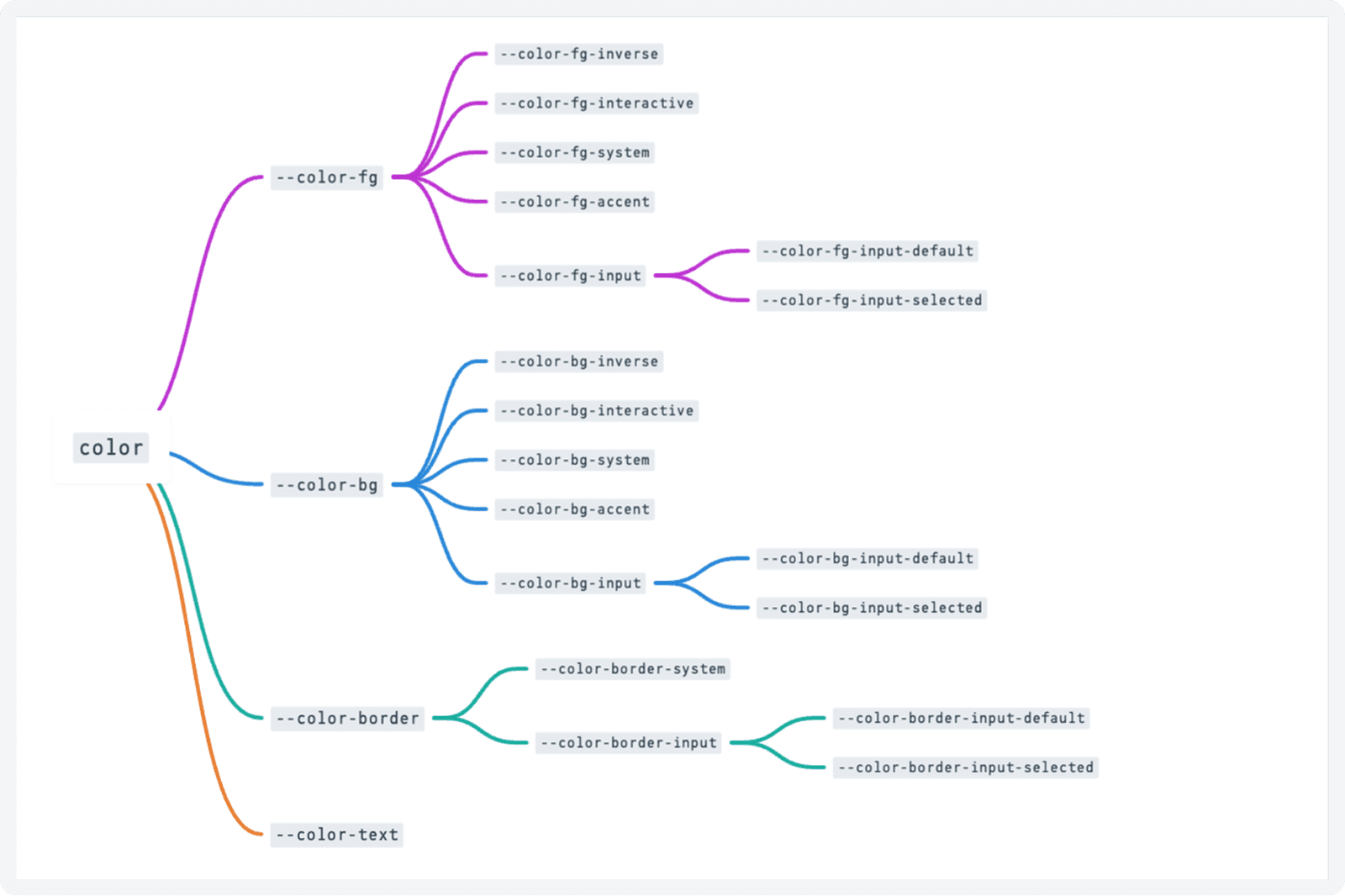
Design Tokens
Federated Design System
Design System website
Publishing Design System
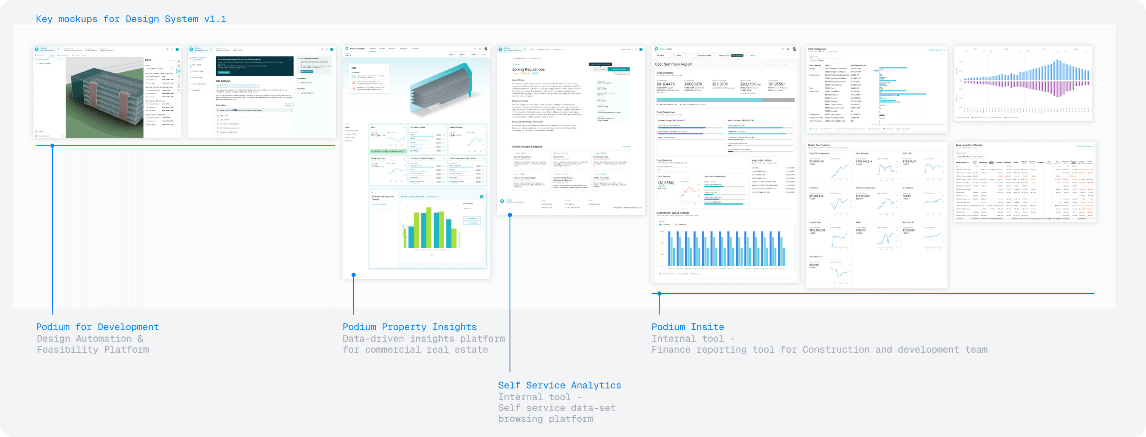
Design System v1.1
We ran a weekly and bi-weekly cadence to keep the system moving without grinding the team. Design, review, test, iterate, publish. Twice a month we'd review implementation priorities with engineering and update Storybook.
Weekly Rhythm
Design and document the component
Internal review with the design team
Testing and iteration
Publish to the library
Engineering implementation review, twice a month
In 2023, Podium has 2 main consumer-facing products and 2 internal products. Design System v1.1 has to cater to different products, and as a result, we began to explore and incorporate visualisation, advanced table layouts, and form displays into the design system.
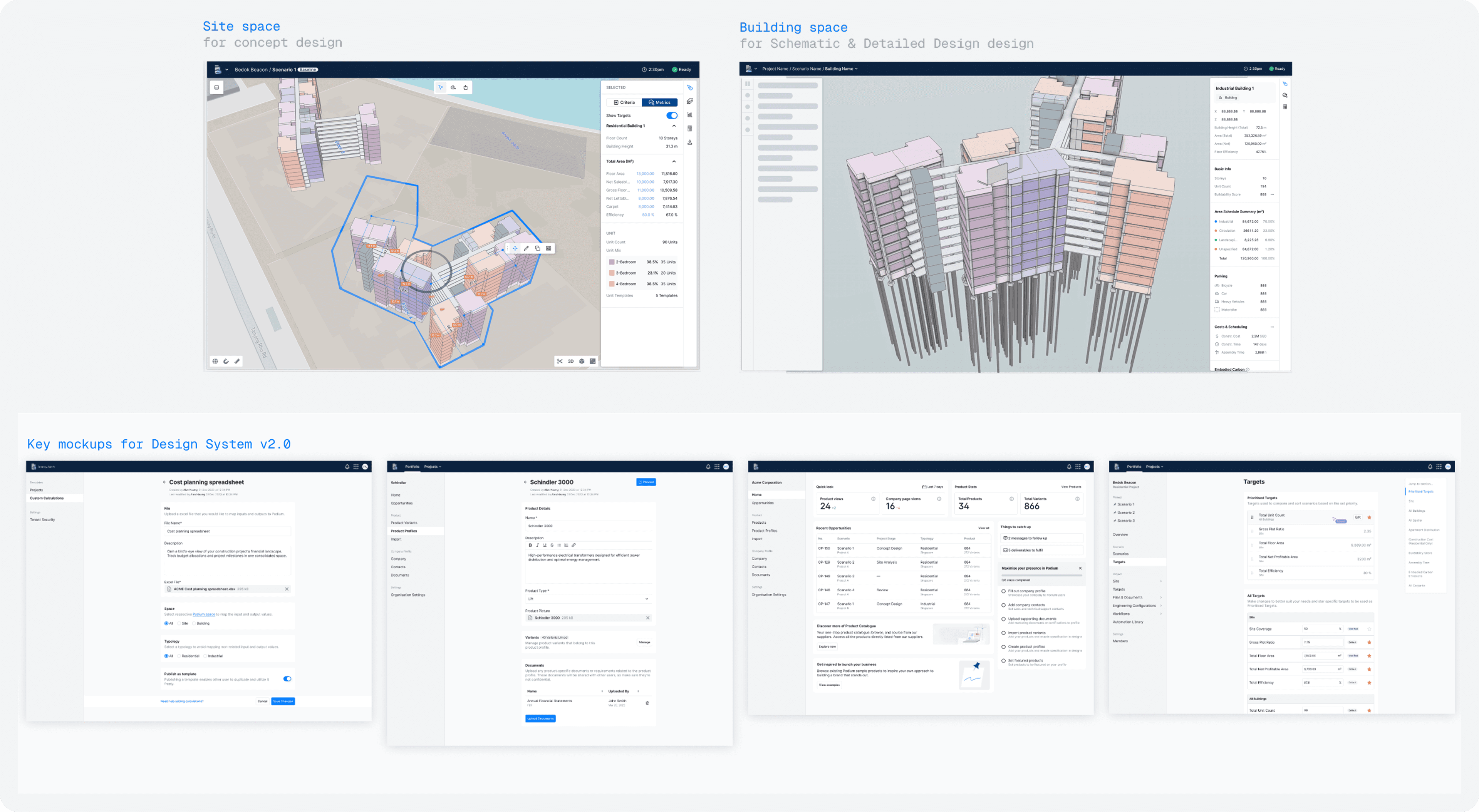
Design System v2.0
At the end of 2023, Podium separated from Lendlease and became its own startup. Teams were restructured. The product direction shifted. And the design system, which had been built inside the Lendlease context, needed to become something new.
Rather than patch it, we upgraded. DS2 addressed the long-term goals we hadn't gotten to yet, and then some.
What Changed
Broke away from Lendlease product lines — this is Podium's system now
New branding and design language built from scratch
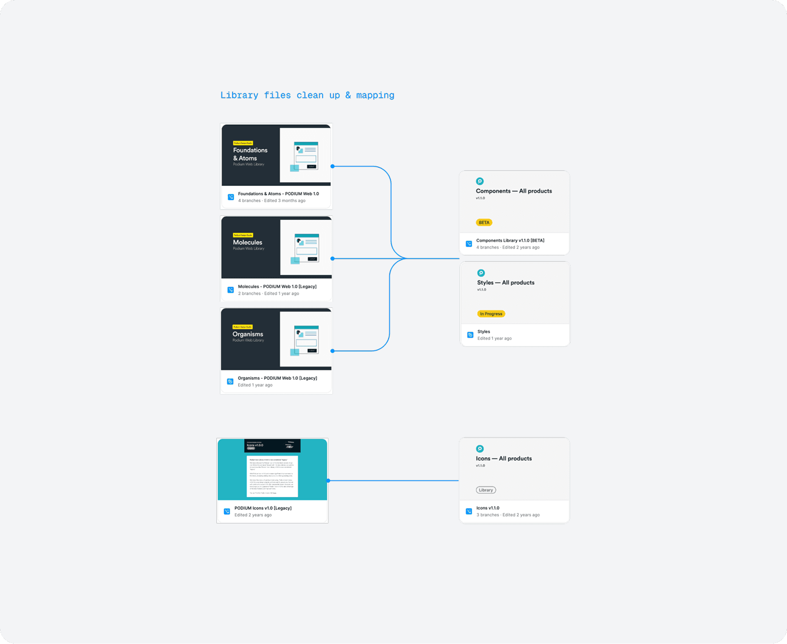
Completely new Foundation library
Component and icon libraries converted to align with the new brand
New navigation and UI patterns throughou
Design tokens, finally shipped
Communication
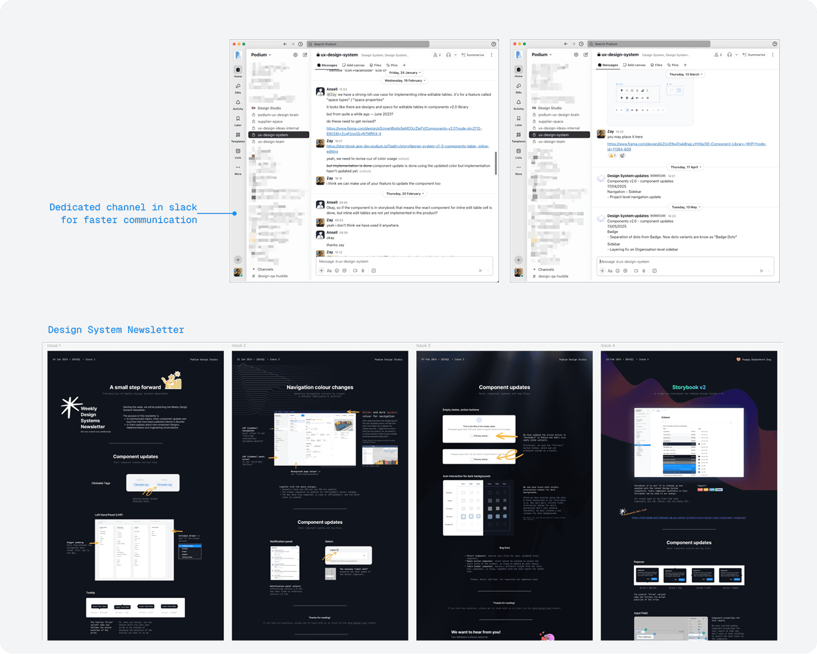
As part of the design system governance and maintenance, we have established the following mode of communication.
Dedicated Slack channel
Provided a single space for updates, feedback, and quick discussions.
Design System Newsletter
Weekly digest highlighting changes, new releases, and best practices.
Bug report workflow
Workflow for designers to flag issues or challenges when designing UI.
Having these approaches created stronger visibility and faster feedback loops among the team, and everyone has a sense that they are contributing to the design system and share ownership.
Outcomes
We didn't set up metrics from the start. That's one of the things I'd do differently if I have to redo it again. But Figma analytics and direct feedback from designers gave a clear enough picture:
Faster onboarding for new designers
Fewer inconsistencies
Improved discoverability and faster searchability
Less conflict between design and dev
Reflection
Looking back, it was never easy. The system was always under-resourced relative to how much it was being asked to do. A few things made it harder than it needed to be:
Adoption resistance
Communicating changes constantly, to a team that was moving fast on features
Balancing delivery timelines against domain-specific work like the 3D design tools
Icons and colours that kept growing with no defined governance
No dedicated resource — the system was owned by one person alongside everything else
No metrics framework from the start, which made it hard to argue for more investment
Future
These past years, I have learnt that a design system is never done. There's always a backlog — better documentation, a more complete colour system, tighter design-dev governance. That list doesn't go away.
The thing I came to understand is that the design system is the product itself. It needs investment, roadmapping, and users who feel ownership over it. Without those things, it decays no matter how well it's built.
As of early 2026, our team has decided to move away from our own design system and adopt the shadcn component library. The decision came as the whole team was moving toward AI-assisted development. LLMs have no training context on a private component library. shadcn is one of the most widely-used open-source UI libraries, which means AI tools understand it natively.
We also accessed that the completeness of the library — community-maintained, Radix-based for accessibility, and well-documented — would be far better off in user experience than keep on maintaining on our own design system.
Currently, we are in the midst of migrating and this would be a another case study for the future.