The following case study is presented for educational purposes only.
The scenarios, events, and individuals described herein are entirely hypothetical and do not represent real-life situations or persons. Any resemblance to actual events, organisations, or individuals, living or dead, is purely coincidental.
Overview
THE PRODUCT:
WorkTogether is a Co-working Space Booking App which allows individuals and teams to book a co-working space for a day or multiple days. WorkTogether provides flexible pricing plans for individuals as well as teams, with subscriptions service and on-demand services.
PROJECT DURATION:
October 2021 - January 2022
MY ROLE:
WorkTogether is a Co-working Space Booking App which allows individuals and teams to book a co-working space for a day or multiple days. WorkTogether provides flexible pricing plans for individuals as well as teams, with subscriptions service and on-demand services.
THE PROBLEM:
For individuals and teams member, it is difficult to find a co-working space near you and book for a period of time or day without a subscription or membership.
RESPONSIBILITIES:
Conducting interviews, paper and digital wireframing, low and high-fidelity prototyping, conducting usability studies, accounting for accessibility, and iterating on designs.
THE GOAL:
Design an app for WorkTogether that allows individuals and teams to easily search a co-working space and book a space.
Understanding the user
User research
Personas
Problem statements
User journey maps
User research: summary
I conducted interviews and created empathy maps, user stories and user journeys to understand the users I’m designing for and their needs. A primary user group identified through research was individuals such as freelancers and teams such as small startups.
The user group confirmed that there is a need for the solution for finding any co-working space around you and being able to book flexibility. The research also revealed that the strong demand for such kind of service especially during pandemics and remote jobs is becoming popular. Other user problems included obligations, stopgaps, or challenges that make it difficult to find or book co-working space.
User research: pain points
Search-ability
Existing apps have no easy way to search without knowing the name of the Co-working space
Accessibility
With a buggy booking process, existing apps have accessibility issues for most of the users
Flexibility
Only membership and subscription are allowed, non-frequent users are missing out in the market
Continuity
No reminders and feedback upon booking and checking in, sometimes users are lost in the process.
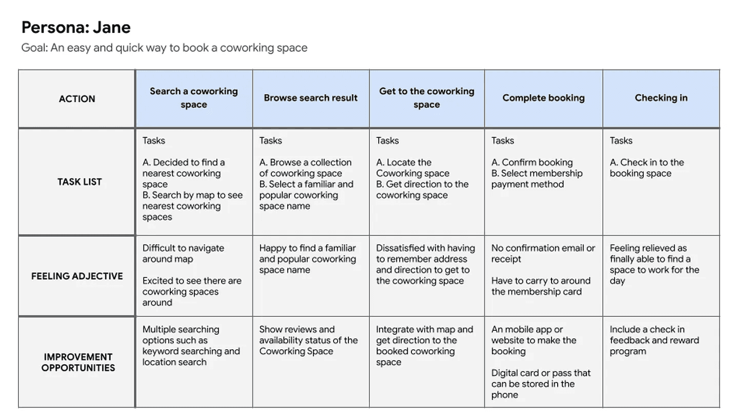
Persona: Jane
Problem statement:
Jane is a marketing executive who needs a solution to find a co-working space easily because she doesn’t want to spend so much time finding and browsing co-working spaces which turns out to be not available to book.

User journey map
Mapping Jane’s user journey revealed how helpful it would be for users to have access to a dedicated Co-working space booking app.
Starting the design
Screen flows
Before starting the wireframes, I create a screen flows to see whether how may screens and what kind of functions would each screen contains and what would be my scope is. This helps me understand the key screens that I would need to do for complete the journey.

Digital wireframes
As the initial design phase continued, I made sure to base screen designs on feedback and findings from the user research.

Clearer and elaborative payment options was a key user need to address in the designs in addition to allowing the different types of bookings.

Low-fidelity prototype
Using the completed set of digital wireframes, I created a low-fidelity prototype. The primary user flow I connected was login, search a co-working space, view and book a space and complete the booking. With this flow, the prototype could be used in a usability study.

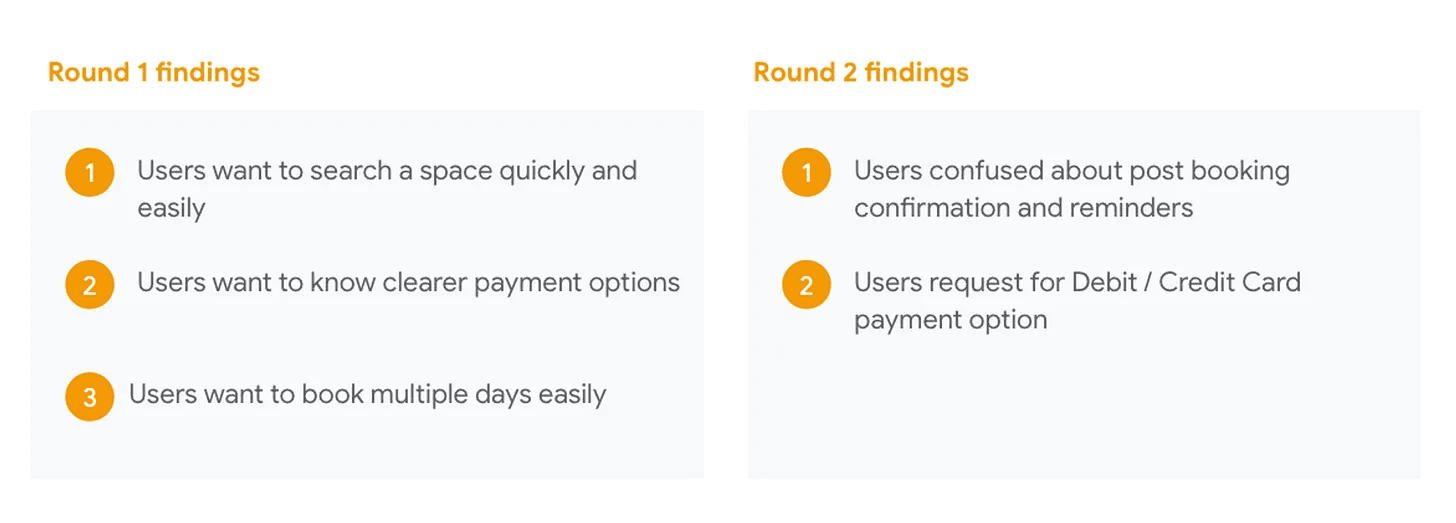
Usability study: findings
I conducted two rounds of usability studies. Findings from the first study helped guide the designs from wireframes to mockups. The second study used a high-fidelity prototype and revealed what aspects of the mockups needed refining.
Refining the design
Mockups
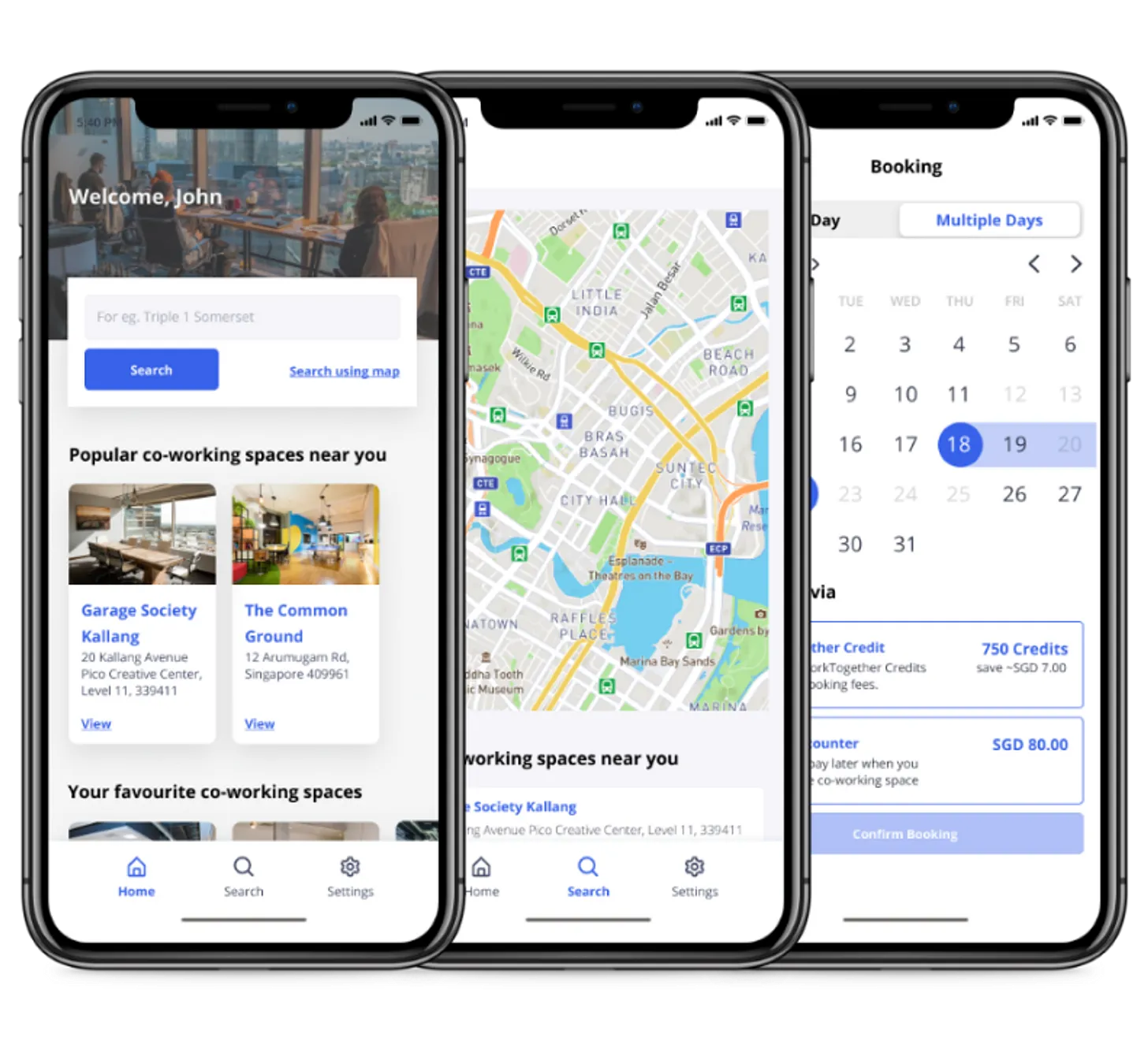
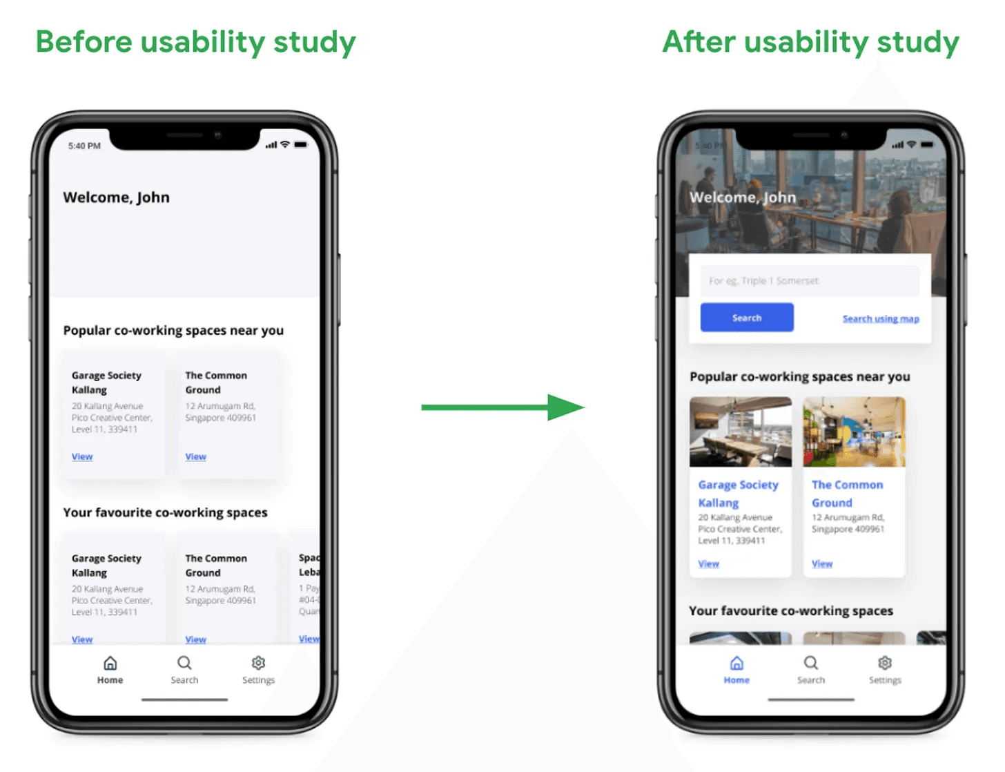
Early designs suggests that users need more prominent cues for searching a space. Therefore, I added a search bar right at the top of the home screen make it easier for user to find a space.

Early designs suggests that users should easily knows they can book multiple days and find a more intuitive way for users to notice the option. So, I revised the booking screen to be more visible for our different types of bookings.
High-fidelity Mockups

High-fidelity prototype
The final high-fidelity prototype presented the cleaner user flows for login, search a co-working space, view and book a space and complete the booking.

Accessibility considerations
Provided access to users who are vision impaired through adding alt text to images for screen readers.
Used icons to help make navigation easier.
Used detailed imagery for co-working space and details information such as disability friendliness to help all users better understand about the co-working space
Going forward
Takeaways
WorkTogether allows the individuals and teams to easily find a Co-working Space and book for a day or period of time, providing a flexibility.
While designing the WorkTogether app, I learned that the first ideas for the app are only the beginning of the process. Usability studies and peer feedback influenced each iteration of the app’s designs.
Next steps
Conduct Usability Studies on updated prototype to collect more insights on whether the solutions work.
Reiterate the design and prototype on Booking Confirmation and Debit / Credit Card Payment.
Integrate map direction, support multi language for targeted markets and voice reader support to provide more accessibility.
WorkTogether is the first case study of the three case studies that I wrote for the Coursera - Google UX Design Professional Certificate course.