The following case study is presented for educational purposes only.
The scenarios, events, and individuals described herein are entirely hypothetical and do not represent real-life situations or persons. Any resemblance to actual events, organisations, or individuals, living or dead, is purely coincidental.
Overview
THE PRODUCT:
Posellery is a social media post aggregator platform for various social media. The platform will show the subscribe posts from the different social media so that user doesn't need to open different apps to consume the news and activities of their friends.
PROJECT DURATION:
One Month (January 2022)
THE PROBLEM:
Nowadays, social media platforms are flooded with promoted posts or ads, and users are always faced fallout of privacy oversights issues. Users spend so many time scrolling activities which they don’t necessarily care in the expense of missing out from the important news and friends and families activities.
MY ROLE:
Product Designer designing mobile and web platform for Posellery from Ideation to Delivery.
THE GOAL:
Design an responsive web platform Posellary, where users can connect and browse different social media in one place.
RESPONSIBILITIES:
Conducting interviews, paper and digital wireframing, low and high-fidelity prototyping, conducting usability studies, accounting for accessibility, and iterating on designs.
Understanding the user
User research: summary
I conducted interviews and created empathy maps, user stories and user journey to understand the users I’m designing for and their needs. A primary user group identified through young adults, middle-aged and late millennials.
The user group confirmed that there is a need for the solution a solution to use social media effectively and efficiently because users doesn’t want to spend so much time browsing and following activities and news they doesn't care about.
User research: pain points
Accessibility: Existing social media apps provides lots of functions which confuses the users, use lots of personal information and data.
Flexibility: Users has to open different apps to consume news and activities, which results in time consuming to scan through the different feeds.
Continuity: Having to open multiple apps and cannot continue where the user left off in other devices.
Persona: Josh
Problem statement
Josh is a busy student who needs a solution to use social media effectively and efficiently because he doesn’t want to spend so much time browsing and following activities and news he doesn't care about.

Site map
Organised and sorted the site map for users to successfully experience and interact with the app or website.

Starting the design
Digital wireframes
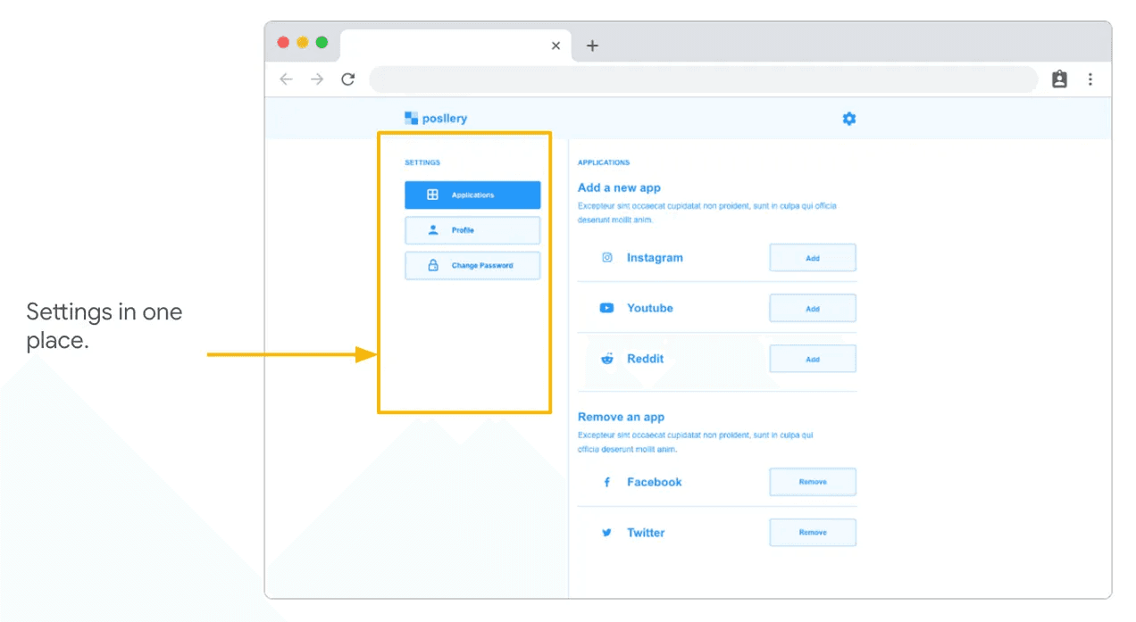
All settings in one place and adopt same layout for consistency and standardised layout.
As the initial design phase continued, I made sure to base screen designs on feedback and findings from the user research.
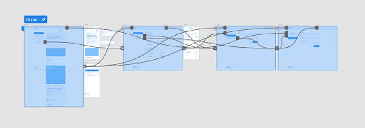
Low-fidelity prototype
Using the completed set of digital wireframes, I created a low-fidelity prototype. The primary user flow I connected was feeds, add or remove a social media application. With this flow, the prototype could be used in a usability study.
Usability study: findings
I conducted two rounds of usability studies. Findings from the first study helped guide the designs from wireframes to mockups. The second study used a high-fidelity prototype and revealed what aspects of the mockups needed refining.

Refining the design
Mockups
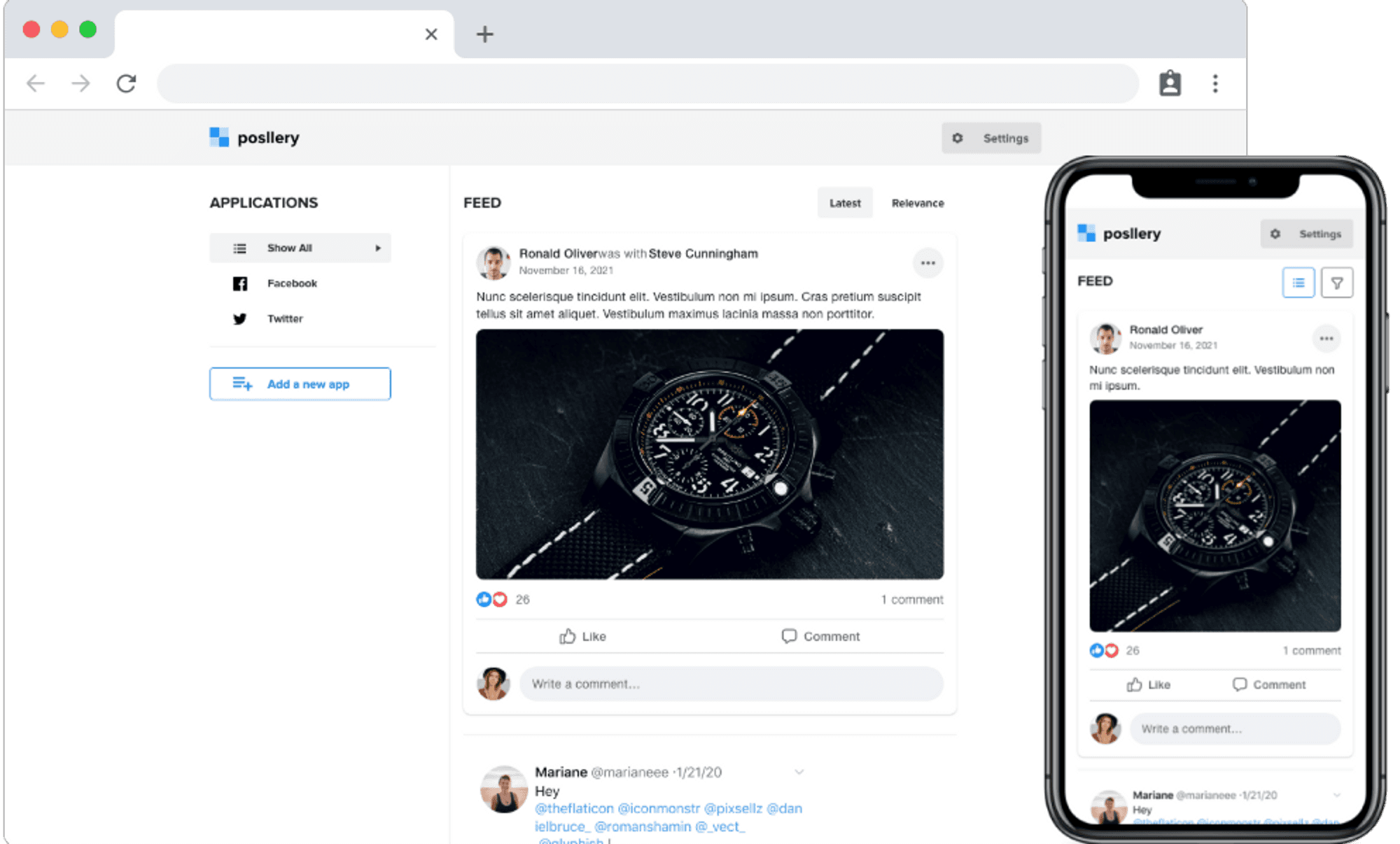
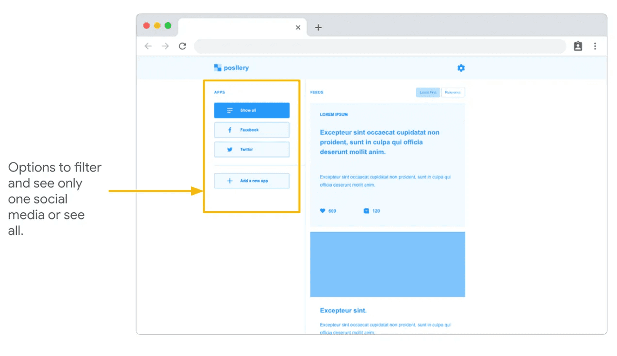
Early designs suggests that two browsing patterns: Latest Feeds or Relevance. Also users want option to see all or a specific social media feeds. Therefore, I added a filter and sorting icons right at the top of the home screen to make it easier for user to sort and browse.

Early designs suggests that were confused with adding and removing application overlay. Therefore I added those configuration under the settings, which also solve the issue of having too many non-standardised, inconsistency layout.

High-fidelity Mockups

High-fidelity prototype
The final high-fidelity prototype presented the cleaner user flows for feeds, add or remove a social media application to complete the browsing experience.
Accessibility considerations
Provided access to users who are vision impaired through adding alt text to images for screen readers.
Used icons to help make navigation easier.
Used neutral colour to make the experience friendly and comfortable, especially for the different kinds of vision impaired and colour blind users.
Going forward
Takeaways
IMPACT:
Posellery provide a simpler and less time consuming ways of browsing social media, by being on the same platform and browse through the subscribe posts from the different social media.
While designing the Posellery app, I learned that the first ideas for the app are only the beginning of the process. Usability studies and peer feedback influenced each iteration of the app’s designs.
Next steps
Conduct Usability Studies on updated prototype to collect more insights on whether the solutions work.
Refine the home/feed experience for smooth and seamless browsing and scrolling experience.
Integrate more functions such as chats and posting services, for those applications which provides the API.
Posellery is the second case study of the three case studies that I wrote as part of the Coursera - Google UX Design Professional Certificate course.